
Lego or Playmobil
"Building applications using Standard JSF components versus readymade component libraries"
You might have seen a 4-year-old child building a wall for the first time. He puts the lego blocks directly on top of each other rather than putting them beside each other and joining two adjacent stones with a stone on top. Then he wonders why the wall always falls down. It could be experienced by asking a developer with less experience to build a table of which each row opens a detail view. The developer puts a h:commandLink inside the h:column of h:dataTable and calls a backing bean method on that link. After clicking the link, the backing bean method gets called but the developer is not sure which row was clicked.
Drawbacks in readymade component libraries
If that child or developer is lucky, he would have a father or Experience developer around to suggest the correct solution (Sometimes an article like this could be sufficient as well). Otherwise, out of frustration, that child turns to his Playmobil Farm Set with clear-cut wall joints and 2-3 different setups to build the Farm. The developer searches the Internet for available component libraries (like Tomahawk, Trininad etc.) which could solve his problem. He finds the solution by watching live demos from Tomahawk, Trininad, Tobago, Richfaces or Icefaces.
At this moment, both (developer and child) might not be aware of what they are losing; they drift away from standard. They get dazzling successes: The child builds the first wall quite fast and easily attaches the next part to it. Difficulties arise if he wants to move the window by a few centimeters. Similarly, use of readymade component libraries has got the following drawbacks:
- Applications with standard JSF components are easy to upgrade. A new JSF version would provide backward compatibility, or, if necessary, at least a migration howto. On the other hand, if further development of a component library is stopped after few years upgrading to the next JSF version might mean completely overhauling the application.
- Applications with standard JSF components can be expected to run with every application server that has passed Sun’s compatibility test. For example, migration from Glassfish to BEA 10 would be just a matter of configuration. How easy (or difficult) the migration of an application using component libraries would be, depends on the implementation of the component library. As some new application server could be developed after the release of the component library, no component library can guarantee the compatibility with every application server.
- Extensions of the standard JSF framework like integration into a portlet engine are not supported by every component library. Thus, usage of component libraries may hinder the introduction of such an extension.
- As standard JSF components are used by a larger community than component libraries, they are better tested and thus expectably show a lower bug rate. On the other hand component libraries have less testers and thus more undiscovered bugs.
If a problem can be solved using standard JSF components but it is solved using an extension component out of unawareness of the correct implementation pattern, upgrades can become more difficult, migrations more complicated, extendibility is worse and having to deal with bugs in the component is more probable.
Non intrusiveness
Listing the problems due to use of the JSF-component libraries does not mean to refuse their usage completely: In some cases, extension components are very useful.
Thinking in terms of Components is the core of the JSF philosophy. To achieve maximum extendability and maintainability it is helpful to keep to the standard wherever possible and to add extensions only where the standard is not sufficient. Any good component should extend the standard JSF component without introducing a proprietary usage pattern so that exchanging or removing the component would be easily possible, without major changes to the source code. I call this property of the component "non intrusiveness" - the older sister of reusability. A component with this property does not make applications heavily dependent upon it.
Patterns for Standard JSF Components
Building a page with a couple of input fields and a Submit button does not need a new Framework. A simple JSP is sufficient for this. The real test will be to build a complex GUI. I usually make my first impression over a new framework by looking how a simple table can be built. How easy it is to show a simple list out of the object model? How flexible is the representation of the GUI? Moreover, what does the developer have to add in order to store a changed row back to the model?
JSF provides answers to all of these questions. Using JSF, simple applications can be built intuitively. To build a complex GUI using standard JSF components it is helpful to know some implementation patterns. I have already experienced some Aha-effect while explaining these patterns to JSF developers I coached.
Abstracts for impatient readers
Before going into details I would like to give you the abstracts of the described patterns, so you can pick the parts you are interested in.
Implementation pattern 1: Row Method If a hyperlink or a button is positioned inside a table row the triggered action should be a method of the row object. This way other attributes of the row can be easily accessed during method execution. This pattern is simple and it puts the logic where it belongs: into the row object that was addressed from the GUI.
Implementation pattern 2: External Header When using a h:dataTable you may need to give separate CSS styles for table header and table body. This will help you to implement a vertical scrollbar for the table body, a table header with 2 rows or a clickable header that toggles the body open and close.
Implementation pattern 3: Script injection A Javascript running at the end of the page searches for elements following some naming conventions and puts Javascript functions on to some events of these elements. With the scripts contained in scriptInjection.js you can add rollover and click effects to the rows of h:dataTable. RadioButtons distributed all over the page and in h:dataTable rows can be grouped to behave like a RadioGroup. Isn’t it wonderful, how easily standard JSF components can be used for complex GUIs?
Implementation pattern 4: Nested tables Even trees can be built with standard JSF components. You do this by nesting h:dataTables. The headers are implemented as external headers (pattern 2) forming the tree rows and the content consists of one single row containing the next levels dataTable. This tree works on a model that simply consists of java.util.Lists nested in java.util.Lists. With this pattern, developing trees with JSF is great fun!
Implementation pattern 5: Script Binding To address an HTML element via Javascript you need its HTML Id, but the Ids are generated by JSF, so using Javascript with JSF generated HTML can become difficult. You need to bind a backing bean property to the JSF component via the JSF tags binding attribute to retrieve the generated clientId through the components getClientID(context) method. This pattern opens JSF to the usage with all the JavaScripts you where using with JSP.
Implementation pattern 1: Row Method
This pattern can be applied, if the requirement is to have a h:dataTable with a hyperlink in each row and an action behind that link that accesses other attributes of that row.
With JSF, tables with a variable row count are implemented using the h:dataTable tag. The data model behind a h:dataTable is a list of row objects. Each column is built using h:column tag in which any standard JSF component can be nested.
Mostly it is required to trigger some action of the row object (e.g. show a detail view or delete a row). As explained in the beginning, developers nest an h:commandLink in an h:column and attach a bean method to it. Every click on the link will trigger the same bean method. As it is not possible to pass any parameters to the bean method, it cannot be determined at execution time which table row was clicked.
The trick is to implement the method within the row object. The action triggers the two objects method and after clicking the row, the method can simply operate on the properties of that row object.
Row Selection with Row Method Pattern
With the Row Method pattern, tables can also be built in such a way that clicking the row shows the selection (e.g. by changing the background color of that row.)
Here is how this solution is implemented: Each row contains a toggle() method, which does the selection and the container (class ListItems), remembers the selection in its property selectedId. Please see the example code in Listing1 for reference.
public class ListItems extends ArrayList {
	private Long selectedId;
	public Long getSelectedId() {
		return selectedId
	}
	public void setSelectedId(Long selectedId) {
		this.selectedId= selectedId
	}
}
public class Item {
	private Long id;
	public String toggle() {
		FacesContext context = FacesContext.getCurrentInstance();
		/* alternative for JSF 1.1 */
		((ListItems)context.getApplication().
		createValueBinding(“#{listItems}”).getValue(context)).
		setSelectedId(id);
		/* alternative for JSF 1.2
		((ListItems)context.getApplication().getExpressionFactory().
		createValueExpression
		(context.getELContext(),“#{listItems}”,ListItems.class).
		getValue(context.getELContext())).setSelectedId(id);
		/* returning null induces a roundtrip */
		return null;
	}
}
This example can also be modified to enable multiple row selection. In this case, each row has a property that stores its state.
private boolean selected;
This property can be changed using method below.
public String toggle() {
	...
	selected = !selected;
	return null;
}
Now by using the EL expression, the style of the selected row is determined as follows:
styleClass=”#{item.selected ? ‘rowSelected’ : ‘’ }“
That is it. Now we have got a table with clickable rows.
Implementation pattern 2: External Header
Using standard JSF components, a table is built in the following way.
<h:dataTable id="books" columnClasses="column-center,column-right" value="#{bookStore.items}" var="var">
  	<h:column>
   		 <f:facet name="header">
     		 <h:outputText  value="Name"/>
    		</f:facet>
     		<h:outputText value="#{var.name}"/>
  	</h:column>
	...
The styles for both header and body part of the table are defined by the h:dataTable tag. That means the styles for header and body part of the table are defined in one place hence cannot be defined separately.
Often it is required to have a table with different styles for header and body. One example of such a requirement is a table of which the body has got a vertical scrollbar and the header remains fix. Another example are trees built by nested datatables (see pattern 4) where the body should be collapsed by clicking the header. A third example that needs separated styles for header and body are grouped column headers where two header rows with separate styles are required for grouping.
So how can header and body styles be separated using the JSF standard components? To achive this the table header is rendered using h:panelGrid and the table body is rendered by an h:dataTable element. See Listing 2. For the body part the h:dataTable has one h:column, which has an h:panelGrid inside it. The same CSS style classes are given to the h:panelGrid, which renders the header and the h:panelGrid, which renders the data columns so that both header and body columns stay exactly below each other.
<h:panelGrid ..
	<!—for header columns -->
</h:panelGrid>
<h:dataTable ..
	<h:column ..
		<h:panelGrid ..
			<!— for body columns-->
		</h:panelGrid>
	</h:column>
<h:dataTable>
Styling External Headers
It is also necessary that by using appropriate CSS styles, tables are displayed below each other without any gap between them and columns are not stretched beyond their given size because of larger contents. TABLE, TR and TD can be given appropriate border-collapse and border-style properties to remove borders between table cells paddings that are introduces by default browser styles. Style table-layout: fixed preserves the height and width of the cell to the given value. In Listing 3, you have styles that set the table’s width to 100% and keep the cell height fixed to 20px.
table {
	table-layout: fixed;
	border-collapse: collapse;
	border: 0px;
	width:100%;
}

tr {
	border: 0px;
}

td {
	border: 0px;
	padding:0px;
	height:20px;
}
Vertical Scrollbar with External Header pattern
The scrollbar should appear only for the body part of the table while the header should remain fixed. Otherwise, the header will be hidden upon scrolling down. Getting the vertical scrollbar only for the body part of the table requires the following two steps.
-
The
h:dataTabletag of the body is enclosed with a div tag as below.
The following style is applied to the div layer.<f:verbatim><div class=”tablebody”></f:verbatim> <h:dataTable ... <f:verbatim></div></f:verbatim>
.tablebody { /* height of the body part, please enter here.*/ height:100px; overflow-x:none; overflow-y:scroll; } -
The scrollbar on the right side of the body table decreases the space available for the body columns. Hence header column and body columns will not be displayed exactly below each other. This problem can be solved by adding one additional empty column to the
h:panelGridof header columns.
This extra column will have width of 17px, which is the exact width of a vertical scrollbar.<h:column> <h:outputText escape=”false” value=” ” /> </h:column>
Implementation Pattern 3: Script Injection
Building a table with the h:dataTable tag is quite easy. This tag iterates automatically over the supplied datalist and renders the TABLE, TBODY, TR und TD tags. Styles for rows and columns of a table can be also easily applied by using rowClasses and columnClasses attributes of the tag. Unfortunately, the attributes do not include a way to add javascript events like onClick, onMouseOver or onMouseOut to table rows.
Two different approaches can be chosen to build a table with this kind of features. One approach is to simply use non-standard JSF components. As using standard components provides many advantages (as shown above) the other approach is to add the required functionality to an h:dataTable through script injection.
Script injection means having a javascript running over the rendered HTML page that searches the HTML table element and adds the required events to its child tr elements. Such a javascript is added in the end of the page so that it can start, once the entire page is rendered. To inject the required event listeners into the corresponding HTML elements it is required that the JSF Ids of those elements follow a naming convention. Every desired behaviour is associated with a specific naming convention. The JSF Id of a component that is to be enriched with a specific behaviour must follow the associated naming convention. The script at the end of the page iterates over the elements of an HMTL page and injects the behaviour into all the elements that follow the naming convention.
At http://www.j4fry.org/scriptinjection.shtml you can download a script that provides four different naming conventions: Rollover Effect, Single Row Selection, Multiple Row Selection und RadioGroups. They all are easy to use and substantially increase the usability of the application.
Rollover Effect: As the mouse pointer moves over a table row, the style class of the row changes. Such an effect looks great and the user gets a better survey over the corresponding columns of a row. Single Row Selection and Multiple Row Selection: Make table rows selectable by clicking them and change their style once they have been clicked. Radio Groups: Allow RadioButtons, which are distributed all over a page and in table rows to be grouped and behave like RadioGroups.
Implementation pattern 4: Nested Tables
Tree views are an important part of web application development. Implementing tree views based on JSPs leads to complicated code, which is difficult to read and maintain.
Several readymade JSF components are available which display tree views. I suggest avoiding the usage of components, that force a proprietary object model to support the view as this would introduce a dependency of the external component to the application model. A simple list, which again contains lists as its elements, should be sufficient to back any tree view.
By using Standard JSF components and a list in a list model, trees can be easily displayed. Each branch node will be displayed by using h:dataTable. The child leaf nodes of this branch will simply be displayed with h:outputTexts but the child branch nodes will again be displayed using another h:dataTable. This way h:dataTables are nested to display a tree. Implementing a tree using this pattern is not only simple but also provides high flexibility due to the use of standard JSF components.
Let us have a look at the following picture. You can see three sublevels below tree root "portfolio no. 1".
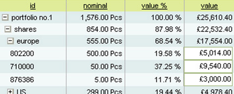
Each node row (shares, europe ...) is displayed by using h:dataTable and the child node row (europe) is nested inside the h:dataTable of the parent node row(shares). You find the source code for this example in Listing 4. Below are some important implementation tricks.
Opening and closing of tree nodes with the Nested Tables pattern
The h:panelGrid containing the node row (which is to be opened or closed) is enclosed in a h:commandLink tag. The action of this h:commandLink changes the state (open or close) of the node by calling the toggle() method of the node’s backing bean. This toggle() method changes the property of the backing bean (open or close). The rendered attribute of the h:dataTable then decides whether children node rows are displayed or hidden.
public class Node {
	private boolean open;
	private List children;

	public boolean isOpen() {
		return open;
	}

	public List getChildren() {
		return children;
	}

	public void setChildren(List children) {
		this.children = children;
	}

	public int getChildCount() {
		return children = null ? null : children.size();
	}

	public String toggle() {
		open = !open;
	}
}
<h:panelGrid columns=”3” columnClasses=”col1,col2, col3”>
	<h:outputText value=”Header1” />
	<h:outputText value=”Header2” />
	<h:outputText value=”Header3” />
</h:panelGrid>
<h:commandLink action=”#{tree.toggle}”>
	<h:panelGrid columns=”3” columnClasses=”col1,col2,col3”>
		<h:outputText value=”#{tree.property1}” />
		<h:outputText value=”#{tree.property2}” />
		<h:outputText value=”#{tree.property3}” />
	</h:panelGrid>
</h:commandLink>
<h:dataTable value=“#{tree.children}“ var=“itemLevel1“
	rendered=”#{tree.open}” columnClasses=”nodeCol”>
	<h:column>
		<h:commandLink action=”#{itemLevel1.toggle}”>
			<h:panelGrid columns=”4” columnClasses=”indentLevel1,col1Level1, col2, col3”>
				<h:outputText value=” ” />
				<h:outputText value=”#{itemLevel1.property1}”>
				<h:outputText value=”#{itemLevel1.property2}”>
				<h:outputText value=”#{itemLevel1.property3}”>
			</h:panelGrid>
		</h:commandLink>
		<h:dataTable value=“#{ itemLevel1.nodes}“ var=“itemLevel2“
			rendered=”#{itemLevel1.open and itemLevel1.childCount>0}” columnClasses=”nodeCol”>
			<h:column>
				<h:commandLink action=”#{itemLevel2.toggle}”>
					<h:panelGrid columns=”3” columnClasses=”indentLevel2,col1Level2, col2, col3”>
						<h:outputText value=” ” />
						<h:outputText value=”#{itemLevel2.property1}” />
						<h:outputText value=”#{itemLevel2.property2}” />
						<h:outputText value=”#{itemLevel2.property3}” />
					</h:panelGrid>
				</h:commandLink>
				<h:dataTable value=“#{itemLevel2.children}“ var=“itemLevel3“
					rendered=”#{itemLevel2.open and itemLevel2.childCount>0}” columnClasses=”nodeCol”>
					<h:column>
						<h:panelGrid columns=”3” columnClasses=”indentLevel3,col1Level3, col2, col3”>
							<h:outputText value=” ” />
							<h:outputText value= ”#{itemLevel3.property1}” />
							<h:outputText value= ”#{itemLevel3.property2}” />
							<h:outputText value= ”#{itemLevel3.property3}” />
						</h:panelGrid>
					</h:column>
				</h:dataTable>
			</h:column>
		</h:dataTable>
	</h:column>
</h:dataTable>
Styling of nested tables
The same styles can be applied as shown in “Styling External Header” (Listing 3). In addition to those styles, the height for every cell is set to 100%. As tables are nested, the cell displaying the parent node could be more than one row high. For example, the cell displaying the row "shares" will display one row when its state is close and in an open state same cell will display 5 rows. This style can be found in Listing 5 along with the style for displaying indentation.
td.nodeCol {
	height:100%;
}

td.col1{
	width:100px;
}

td.indentLevel1{
	width:10px;
}

td.col1Level1{
	width:90px;
}

td.indentLevel2{
	width:20px;
}

td.col1Level2{
	width:80px;
}

td.indentLevel3{
	width:30px;
}

td.col1Level3{
	width:70px;
}
Beautifying trees with graphic images
To make this look even better you may want to add a + or – image to indicate if a tree node is toggled open or closed. In the first column of each node
<h:outputText value=” ” />
is replaced by
<h:graphicImage url=”/images/plus.jpg” rendered=”#{!(item.open and item.childCount>0)}”
<h:graphicImage url=”/images/minus.jpg” rendered=”#{item.open and item.childCount>0}”
With some additional pictures the show lines connections of each parent node to its children can be displayed.
Toggling tree nodes using Javascript
Above we have toggled tree nodes on serverside. To implement clientside toggling a Javascript onclick event on the tree node can display or hide a div layer containing its child nodes. There are many panel or collapsiblePanel components available in the Internet which can achive this. The header of the panel will display the tree node and the body will contain the child nodes. At http://www.j4fry.org/J4Fry_Quick_Setup_Tomcat_MyFaces_Hibernate/index.faces you can find examples for this.
Implementation pattern 5: Script Binding
If you want to trigger a Javascript event on a specific HTML element, you need to address the ID of that element. When JSF generates HTML code, it generates the IDs of the html elements. So here problem is to find the ID of an HTML element that is generated at runtime by JSF.
There are three approaches to this problem.
The first is to understand how the generation of IDs works in JSF and to calculate the IDs that JSF will generate. This approach has several drawbacks:
- Changes in the page structure will change the generated ID
- Different JSF implementations generate different IDs
- Templating with <%@include %> or Facelets will generate different IDs in different contexts
- Inside
h:dataTablesdifferent IDs will be generated for each row making it hard to calculate the IDs manually
The second approach is to use a component library. The Tomahawk library provides its own implementation of the JSF standard components. For these components, the IDs can be set along with the optional attribute forceid=true. The generated HTML elements will then have the HTML ID provided by the programmer. This solution solves the problem partially as it does not work for h:dataTables and forces the use of non-standard JSF components.
The approach recommended in this article is called the Script Binding pattern. The pattern uses the component binding feature of JSF to retrieve the generated HTML ID from the JSF component. In the example below a h:commandButtons onclick event is to be triggered by the Javascript function “clickButton”:
<h:commandButton id ="refresh" value="Refresh" action="#{myBean.refresh}" binding="#{myBean.binding}"/>
The corrosponding UIComponent of the h:commandButton is set into the Bean myBean using setBinding(). This component knows exactly which ID is rendered for this refresh button. Bean myBean has got another method called getClientIdForBinding() which returns this ID. The JavaScript is rendered with the help of h:outputText, which uses the getClientIdForBinding() method to get the ID. See code snippets below.
MyBean.java
public UIComponent getBinding() {
		return binding;
}

public void setBinding(UIComponent binding) {
	this.binding = binding;
}

public String getClientIdForBinding() {
	return binding.getClientId(FacesContext.getCurrentInstance());
}
MyPage.jsp
<f:verbatim>
	function clickButton() {
</f:verbatim>
	<h:outputText escape="false" value="
		var button = document.getElementById('#{myBinding.getClientIdForBinding}');
		if(button != null) {
			button.click();
		}
		" />
<f:verbatim>
		}
</f:verbatim>
At http://www.j4fry.org/J4Fry_Quick_Setup_Tomcat_MyFaces_Hibernate/index.faces you can find a Combobox built using standard JSF components. For this Combobox example, four Script Bindings are used to build one component:
- The
onKeyDownevent of the input field shows the options table - In addition, there is a plus sign next to that input field. The onClick event of the plus sign also shows the options table
- When the options table is visible, the plus sign is replaced by a minus sign
- Clicking the minus sign or choosing a value from the options table hides the options table
Summary
Knowing these patterns, you will be able to implement most web applications using the standard JSF components. Even special effects like Date Picker can be implemented using normal JavaScript libraries, thanks to the Script Binding Pattern. Most of the time the same combinations of standard JSF components will be repeatedly used and it would be nice to create a template out of them. Facelets provides a possibility to define such templates. As Facelets will be part of the JSF2.0 specification, there will be two levels of JSF tag libraries: The low-level library will consist of the standard JSF components. High-level libraries will combine those low-level components using Facelets. I am looking forward to use tag libraries based on Facelets and on the standard JSF component library, which implement all kinds of HTML GUI elements you can imagine.
This is a translation of the JavaMagazin article 'Lego Oder Playmobil' written by Ganesh Jung. The orginal article in German can be found at http://www.j4fry.org/resources/jung_JSF_JavaMagazin.pdf. The english translation was done by Prasad Chaudhari.